


2022
Creating a responsive ecommerce website for a popular clothing store chain transitioning from offline to online sales.
Role
UX/UI Designer, Branding
Project Duration
5 Weeks
Read Time
8 Minutes
Overview
The Challenge
Mirror lacks an online presence in the digital transformation game. The website is outdated and only informational rather than transactional. Customers want a convenient way to shop from the comfort of their homes.
The Objectives
Examine user experience with ecommerce by incorporating aspects that enhances experience, emphasize with customers’ expectations and determine which applications are important to design that would benefit users and explore pain points to increase usability.
Discovery
User Interview
3 individuals, ranging from 21-30 years old, were interviewed. The goal is to learn about how customers shop, their preferences, and specific pain points when shopping on and offline

Competitive Analysis


Define
User Personas

Ideate
After creating the extended persona, I was able to visualize how the ecommerce website functions can be created both visually and logically through wireframe sketches and a sitemap.
Wireframe Sketch


Sitemap

Interaction Design
Linear Task Flow

User Flow
This process shows the user purchasing an outer wear.

UI Wireframe


Responsive Design
UI responsive design for Mirror homepage— Desktop, Tablet, and Mobile.
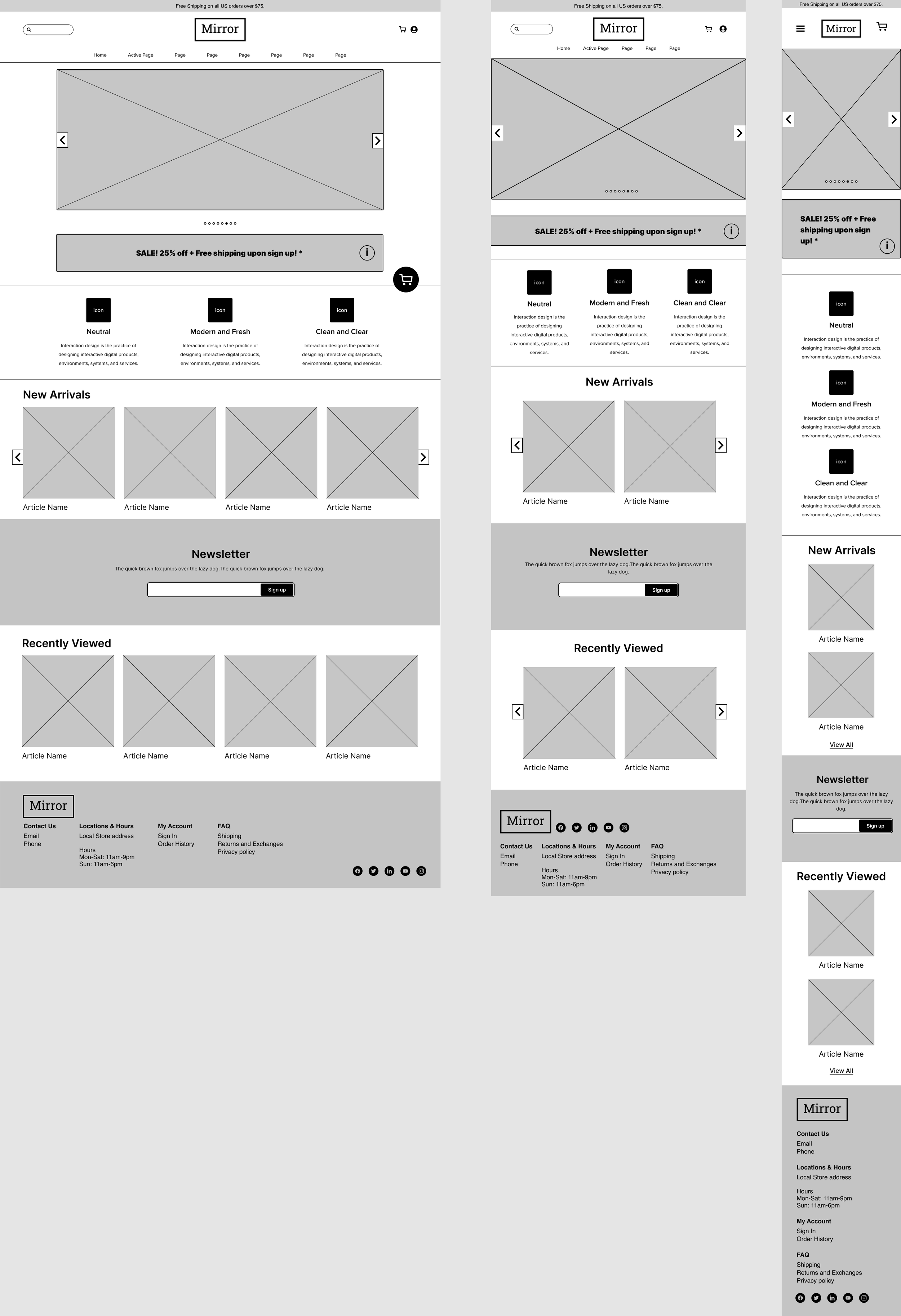

UI Wireframe for Mirror that reflects on the Linear Task Flow from landing page to confirmation page.
Prototype
Style Tile

UI Kit & Branding

UI Design


UI prototype for the responsive design— Mobile
Usability Testing
Mid Fidelity Prototype
Complete a quick shopping experience with Mirror within a few minutes.
Test Mirror’s website navigation– from landing to check out.
Test the efficiency of quick view and quick view cart.
Identify any pain points that users may encounter
Participant shared their screen while accessing the prototype. They were given the task to navigate successfully though the shopping experience and complete a purchase.
Sample questions asked during usability testing interview:
Walk me through what you are seeing on the screen.
If you want to purchase 2 of the same item, how would you proceed?
How would someone proceed if they want to sign up for updates from store?
Affinity Map
Participants: 4
Ages: 23-30
Casual Shoppers

Research Summary
Pain Points
Unfinished designs were more desirable
Wanted to access navigation bar, search bar, and know what the page would look like outside of quick view.
Hard to find where to access when testing on home page.
How to access full view page from homepage
Hard to see “successfully added to cart” pop up
Hoped the prototype to be more interactive
How does cart preview look with more products in it
Success
Participant shared that the UI looks minimalistic and calming. It’s simple and straight forward to use and the CTA buttons were straightforward and easily understood. Quick-view was easy to access. The idea of the cart and pop up was a good idea for users to know that they item was successfully added.
Future Improvements
Create more variety in the home page to allow user to test
More quick view options, and usable navigation bar
Make the quick view cart more noticeable
Create more depth for the web page
Add more effects to make the page look less flat/ unfinished
Choose better colors
Create a full page outside of quick view and how to access it
Allow access to full page in prototype
Conclusion
Users thought the prototype was straightforward and quick to use. There was not a significant obstacle that was too confusing for the user. Most of the problems that were mentioned were more related to the limitations in the prototype or minor problems that could be adjusted.
Next step:
Make iteration of the present prototype
Create a new UI to bring more depth into the page but still keep it very minimal