


2025
Designing a user-friendly website for a claw machine company focused on delivering real time updates, helping users plan ahead, and promoting upcoming events to boost engagement.
Role
UX/UI Designer, Branding
Project Duration
6 Weeks
Read Time
5 minutes
Overview
Project Background
Arcades have become a popular form of entertainment in America for the past century and the industry continues to grow rapidly. With the rise of popular Asian claw machines, combined with traditional arcade games, a new form of entertainment arises.
Problem
As the internet increasingly influences our daily lives, these arcades are expected to meet the growing demand for easy access to information about the best entertainment options.
Objective
Design and create a responsive website that allows users to plan their visit ahead of time.
Discovery
User Interview
4 individuals, ranging from 21-31 years old, were interviewed. The goal is to learn about how users interact with websites and what they are looking for when looking up this form of entertainment— their pain points and preferences when planning their visit.

“I prefer when companies are transparent with their pricing— I hate being surprised upon arrival and then feeling disappointed the whole day. ”
Competitive Research

Define
User Personas

Ideate
Wireframe Sketch
Utilizing the persona created from a collection of interviews, I created a sketch for a basic understanding of how I want the website to look.


Interaction Design
Linear Task Flow

User Flow

UI Wireframe


User Interface
Branding


UI Design


Usability Testing
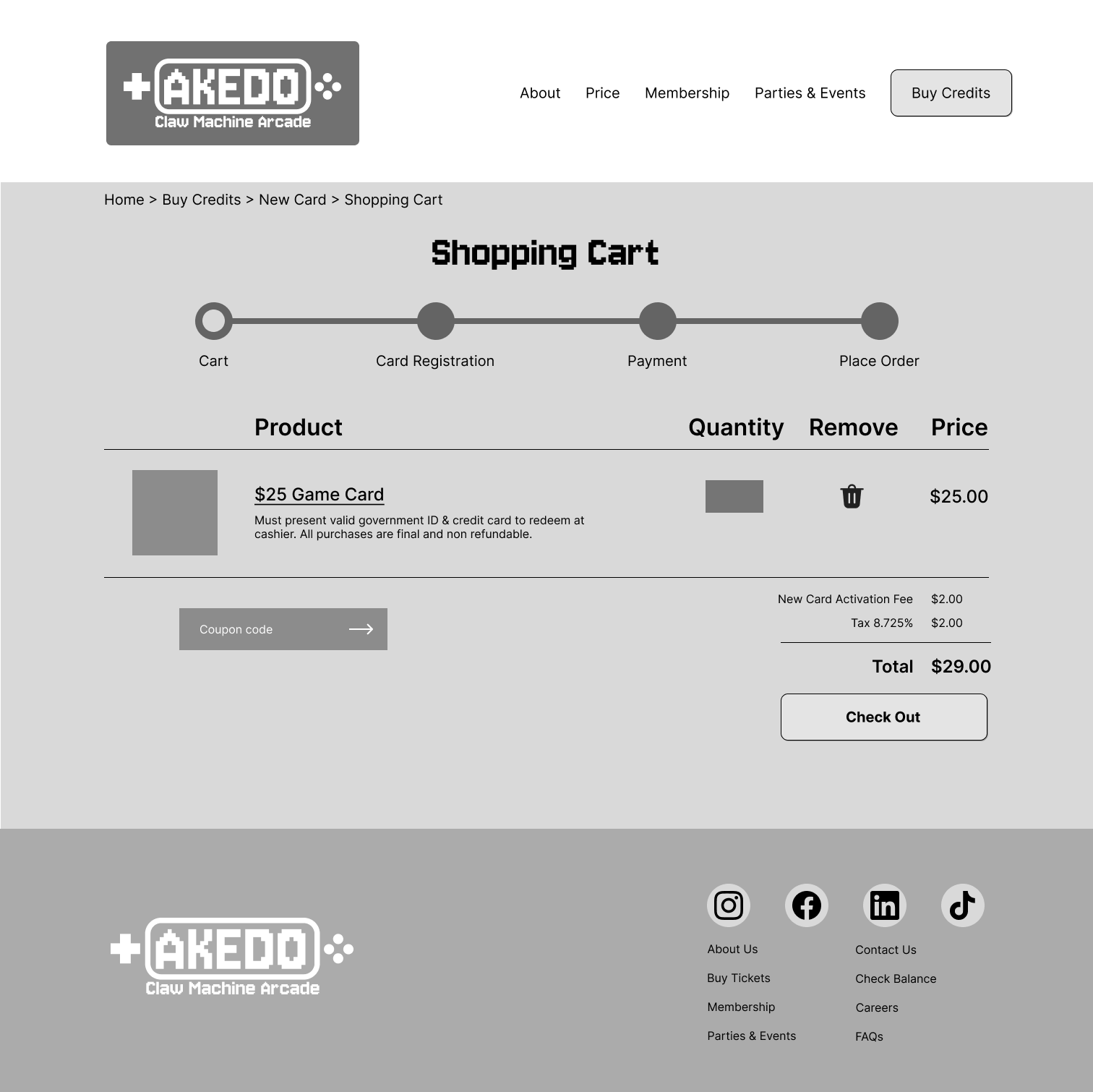
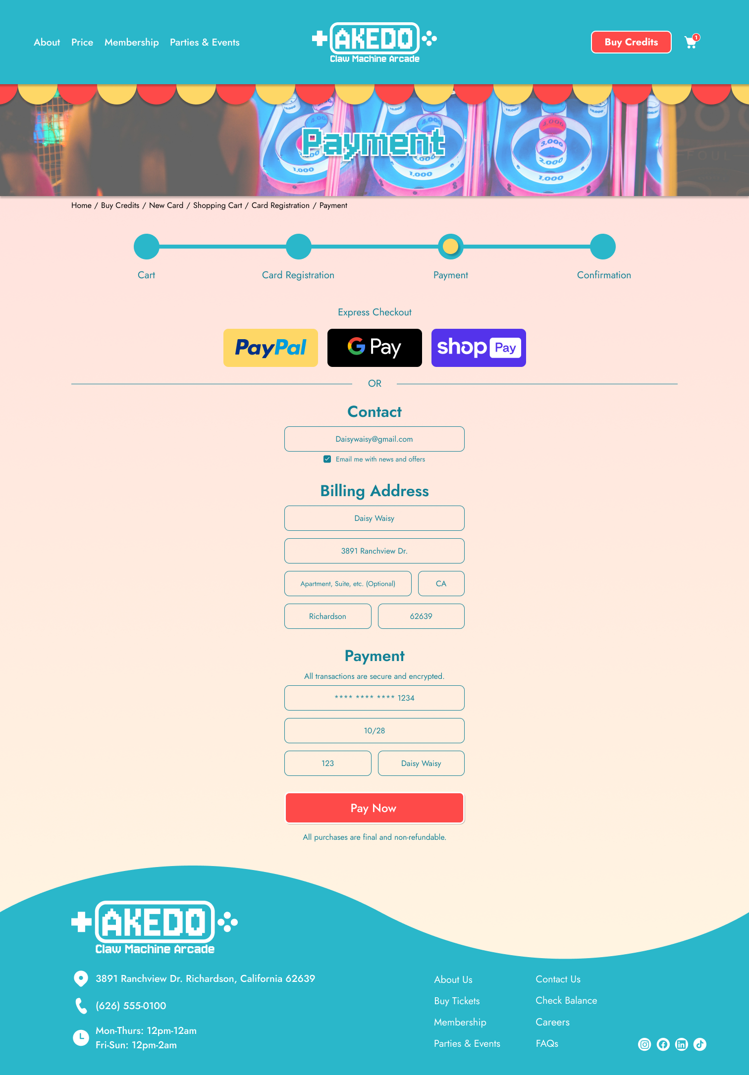
Mid Fidelity Prototype
Participants were tasked to navigate though the website with a few tasks:
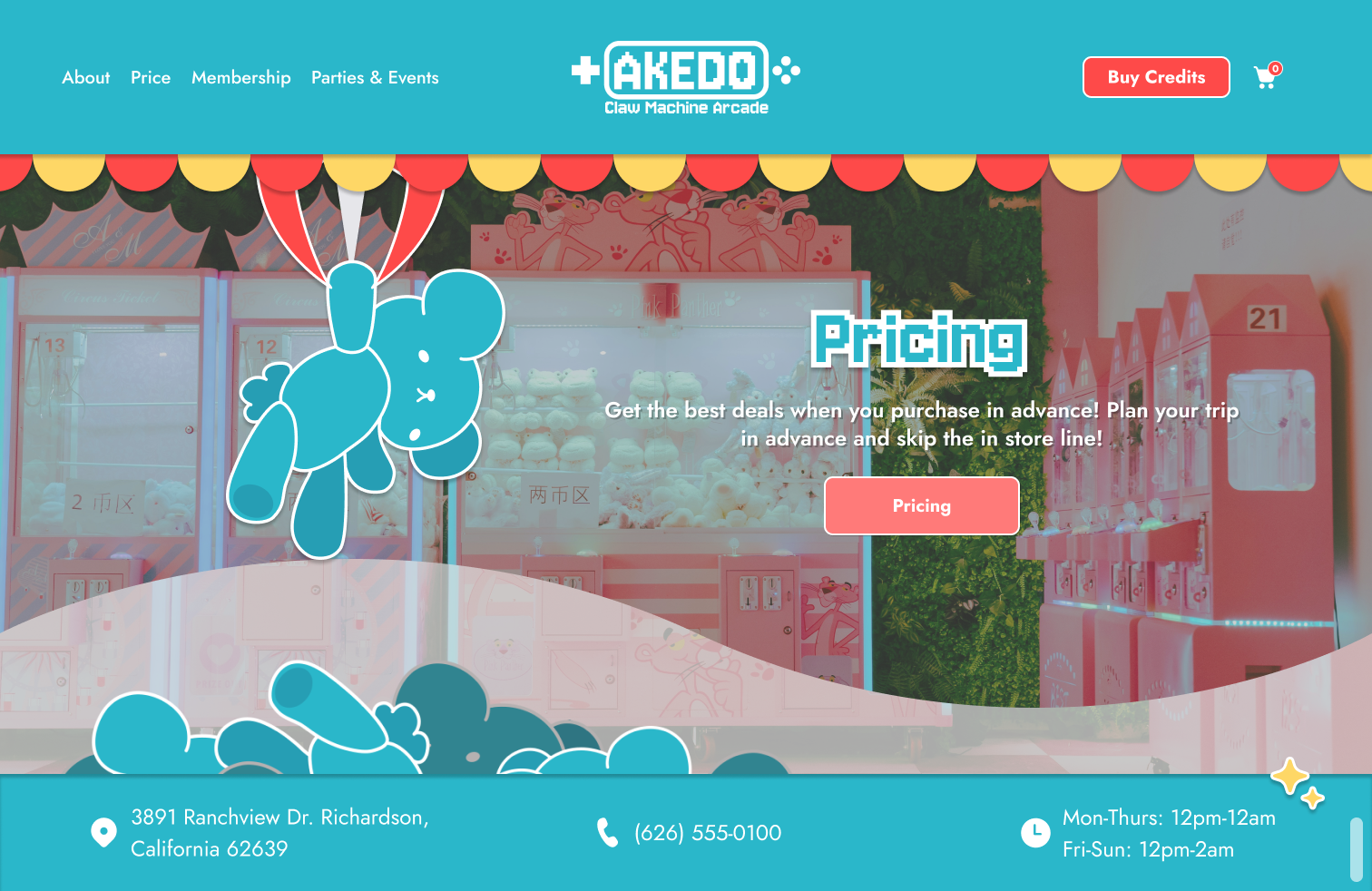
Navigate through the landing page to see what options they have.
Depending on which option the participant chooses, proceed with…
Sign up for news letter and/or
Purchase $25 worth of credits and stop at the confirmation page
Complete usability testing by navigating through the website within a few minutes.
Test Akedo’s website navigation.
Test the efficiency of navigating between the pages.
Identify any pain points that users may encounter when navigating through.
Affinity Map
Affinity map of 4 participants.

Research Summary
Improvements
Pain points from participants that can be modified for a better experience.
Modify landing page for a smoother UI for users to navigate through
Have a separate page for up to date products for claw machines
Work and create the membership page for users to navigate
Can make adjustments to the pricing tab and put it together with purchasing credits
Fix confirmation page after check out
Success
Participants shared that they like the branding and UI for the website. It’s very fitting for the type of store Akedo is. In addition, it was easy to navigate and designed with consideration for users.
Conclusion
Users were successful in navigating through the prototype. Specific details can be adjusted for a better user experience and less repetition. There’s a lot of limitations with the design and participants would like to see more added for a better experience when it comes to planning ahead of their arrivals.